Hey there, I’m having a frustrating issue with the scaling of my site. I have been working from a 13” Laptop and switch to a 27” Dell monitor for ease of working and just to see how it all looks on both screens.
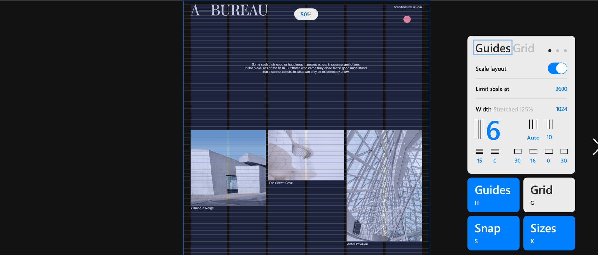
My issue is that when I am working from my monitor, I am positioning everything (animations) for this size, with the ‘scale layout’ box checked in readymag so it should by all accounts be changing automatically with the size of the screen, no? The universality of the website working correctly and looking good on all screens, is a non negotiable in my eyes when it comes to building a site. But I have either been annoyingly re-arranging or re-sizing it when I jump back onto my 13” as I find it has gone all out of whack again.
{Side quest: In my display settings when I connect my laptop to my monitor, literally when I plug it in, it scales to ‘Optimise’ for the Dell, which I have chosen due to obvious reasons… if I optimise to the laptop, the monitor shrinks to the 13” size and I loose half my screen.}
Am I being an absolute twit in thinking because I optimise it to the Dell I should not be doing this and optimise instead for the laptop and work from that size? Or should it scale appropriately when I plug in my monitor and across all screens and monitors. My question then would be, when other users of my site optimise their screens for their monitors it will look crazy right?
Please help! Thanks